
THE DELIVERABLES
*you can interact with the brand book and website!
Brand Book
Website
the team
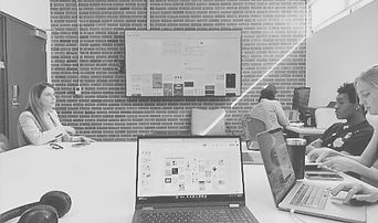
Looking for a fresh brand identity and some welcoming UI/UX design, the client reached out to UF M.I.N.T. Studios, a design studio led by students and supervised by faculty, facilitating collaborations between design teams and clients in the Gainesville community. From the studio, four students emerged to work together on the semester-long challenge: Hannah Caudill, Spencer Gregory, Chloe Girod, and Cat Paroline.


_edited_edited_edite.png)
Designer (web focus)
Cat Paroline
the process
initial client meeting
When the client came to our team, they had a minimum viable product, some investors, and a vision: they wanted to build an AI-driven chatbot that could both help people find lawyers and help lawyers find clients. At the time, the company had a tentative website and a name: Lawbot US. During our initial meeting, the client explained that they wanted the brand to be friendly and approachable, something that the current branding was not conveying. To achieve this, we proposed a building the brand identity from the ground up, starting with the name, and then building out the website and applying the new branding.
Challenge 1: the name

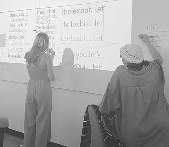
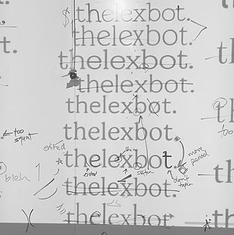
Once we had set our goals, we began the iterative process of devising a name for the product. Knowing that the name would lay the groundwork for the rest of the brand, we invested a large amount of time into this process doing thorough research, brainstorming, and user testing. It was important that the name highlighted the unique features of the product, namely the legal chatbot and it's connection feature, and fit the friendly feeling that the client wished to convey. We also thought it would be interesting to tie in the founder's Italian heritage, especially since the country has such a deep history with the development of law and legal systems. Balancing all of these elements proved to be quite challenging, but once the answer clicked, it immediately felt right. In the end, we decided on "thelexbot." with the tagline "let's connect."
brainstorming brand names

user testing potential brand names

typeface exploration
annotated typefaces
Challenge 2: the branding
With the name established, we moved into establishing the visual identity of the brand. In our initial meeting with the client, they shared several brands whose branding they liked and wanted to emulate as well as some styles they wanted to avoid. From this we were able to glean that they preferred colorful and playful stylings and began gathering more inspiration with this in mind. We then organized the inspiration into multiple art directions which we presented to the client. With client approval on a direction, we began exploring typefaces, color palettes, and illustration styles. In our exploration, we found that we had to walk a fine line between friendly and childish as we wanted the brand to appear both welcoming and reliable. After several iterations and frequent client check-ins, we finalized the visual identity, allowing the branding team to begin compiling our work thus far into a comprehensive brand book while the web team began working on the website.

illustration/logo exploration


final illustrations
Challenge 3: the website
With the branding finalized, the web team was able to start up in earnest on website production. We started with establishing a site map to organize the different interfaces the website necessitated. It was very important to the client that the brand be welcoming and we wanted to ensure that this core value of the brand was implemented not only in the website's styling, but also in its structure. In order to do this, we invested a lot of time in developing the site map, iterating the lo-fi wireframes, and doing lots of user testing to make sure that navigating the site was simple and intuitive. With the bones of the website laid, we began experimenting with different ways to apply the branding until we decided on some concrete styles as well as some elements we wanted to vary throughout the website. With our style guides established, we began experimenting within each individual webpage. As we did, we evolved and altered some of our previously established rules to better fit the content of each page. Through this continual experimentation and iteration, we ended up with finalized hi-fi designs which we then packaged and handed over to the client for them to develop internally.


site map
final wireframes


finalized webpages
the takeaways
Reflection
Through my involvement in this three-month design project alongside three other graphic designers, I gained a wealth of valuable insights and experiences. Firstly, I learned the importance of effective communication and collaboration within a team setting. As we navigated the complexities of crafting a brand identity and website design, clear and open communication among team members proved instrumental in ensuring our collective efforts remained aligned with the project objectives.
Moreover, the project underscored the significance of adaptability and flexibility in the face of evolving client needs and feedback. Our client's limited feedback challenged us to refine our communication skills further, helping her articulate her preferences and concerns more effectively. This process not only deepened our understanding of client management but also sharpened our ability to empathize with their perspectives and tailor our designs accordingly.
Furthermore, the project allowed us to hone both our technical design skills and our soft skills such as problem-solving and client-centric thinking. As we grappled with the intricacies of branding and website development, I discovered the value of creative problem-solving and the importance of approaching challenges with an open mind and innovative mindset.
Overall, this project was a transformative learning experience that equipped me with a diverse array of skills and perspectives essential for success in the dynamic field of graphic design. From fostering teamwork and effective communication to cultivating adaptability and client empathy, the lessons gleaned from this project will undoubtedly shape my future endeavors in the realm of design and beyond.
Hard Skills
Soft Skills
Collaboration: working effectively in a team, share ideas, and leverage each other's strengths to achieve common goals
Adaptability: adapting to changing project requirements, client preferences, and feedback, and make necessary adjustments accordingly
Problem-solving: identifying challenges or issues during the project and finding creative solutions to overcome them
Client Management: fostering positive relationships with clients, understand their needs and preferences, and facilitate open communication to address any concerns
Empathy: understanding the client's perspective, anticipate their needs, and provide solutions that align with their goals and expectations
Graphic Design: proficiency in design software like Figma and Adobe Creative Suite which used to create brand identities, brand books, and website designs
Branding: developing comprehensive brand identities, including logos, color schemes, typography, and visual elements, and compile them into cohesive brand books
Website Design: designing user-friendly and visually appealing websites using UI/UX principles
Communication: communicating design ideas, project progress, and client feedback among team members and with the client
Project Management: managing timelines, tasks, and resources to ensure the project stays on track and meets deadlines